sea and light perspective

Scottish Seas 2 – Evening Tide

Whether it is the ebb or the flow of the tide, the sea has a gentle gradient to cover in this part of South West Scotland. That does not always mean the waves are gentle but on this occasion the roughest it got can be seen in the third image of the sequence below.

evening ebb

The appearance of the weather in that image is exaggerated by the heavy grain effect I gave it. I like the effect but it tells a lie about the conditions, making them appear less favourable than they wereContinue reading

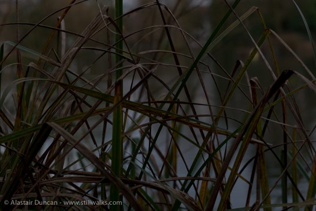
Dark Park Pattern

Dark Park

Looking at and photographing Brynmill Park on my walk this week was a most interesting challenge. While my walk had started in sunlight, by the time the walking forum meeting I was there to attend finished, the light was fading fast and making for an increasingly dark park.

So none of these images are under-exposed – it was dark, but not so much so that my surroundings could not be seen. The complexity of form was flattened as the intricacy ofContinue reading

Admiring the View and Composing the Picture

They are central to the image and framed by the tree but the gulls admiring the view towards the low afternoon sun across the lake are not a big enough in this shot to argue that they were the main feature of my focus – but they were to begin with! Without a longer lens than that provided by my iPhone I had no choice but to consider the composition of the wider scene – but that’s OK because I like the tree as well.

urban lakeside tree

Continue reading

Objects In The Sea

I have no idea what these objects in the sea are! I imagine the distant ones are buoys for shipping. I am pretty sure the larger structure also has something to do with shipping but as it is so close to the Cardiff Bay barrage, where we were walking, I am not sure what its purpose is. It has meteorological equipment on it and clearly it is a convenient pirch for birds – other than that all I can say is that I like the composition of uprights, horizontals and perspective in this shot.

This image can also be seen in black and white on Leanne Cole’s Photography blog post Monochrome Madness 2-29.

The second photo includes Flat Holm and Steep Holm islands in there Bristol Channel.

Cardiff Bay

Flat Holm Island

What I Like – Image Composition

When selecting images to post on this blog I try to pick photos that I like for a range of different reasons – composition, texture, pattern – perhaps most importantly, how well they depict my memory of the place they represent.

My main reason for choosing the images below is composition. In the first shot I particularly like the combined shapes of the light – the oblique oval of reflected light on the water of the canal and the quarter oval of light in the sky. The image, for me, is not so much about the reflection of land on water as the abstract shapes of light and dark, hence my rendering of the second image.

The composition of the last photo has nothing to do with manipulation. This was simply the way the reflection appeared with the apparent shape mask being created by the reflection of the wall and underside of a bridge over the canal. The shot was a little underexposed but this made for a more dynamic and abstract composition.

Complementary images are posted on Instagram through the week and can also be seen on the sidebar of the StillWalks blog.

Tennant Canal

Tennant Canal Composition

abstract reflection


Rusty Composition

The “obelisk” in this photo is a simple fence post but that everyday country object takes on a lot more importance in this composition. Finding the right angle and position for the depth of focus proved a bit of a challenge.

If the image does not present the beauty that is in the surrounding landscape, it does, for me, provide a fascinating range of textures, pattern and colour. The composition itself could be interpreted in any number of ways, but I will leave that to your imagination.

rusty fence

Telling the Story

These are two examples of images I would be unlikely to use – except for one reason. They might form a necessary part of the bigger picture, the image sequence that tells the story of a StillWalk.

An image will tell a story in its own right but as part of a sequence with the intention of taking the viewer from one place to another, both visually and aurally, a StillWalk video needs sometimes to have those joining words or conjunctions that help show progression along the route.

Why would I not use these particular images? There is nothing wrong with the quality of the original images and I have no objection to traffic in an image, particularly in town. However, for some reason the car in this photograph annoys me. Is it because it is the only one or because it is a taxi (no offence to taxi drivers intended)? Maybe it’s because there are no people in the scene?

I like the structure of the shot with the bollards on the left and the wall and railing uprights on the right, the shadow of the balcony on the right and the progression from modern to older architecture on the left. I like the way the spire in the background divides up the sky and the colour is correct for the time of day / year and weather . . . but for some reason I don’t like the car!

All comments are welcome about this.

York

York

I don’t like the crop in the image below. The original needed straightening and in doing so I have lost the point of the weather vane and the chimney which both fitted neatly into the original frame – frustrating.

York

York